- Home /
1 Material per Texture (Tiling) VS. UV Baked Texture
I hope everyone understands what i mean and i know i will kinda answer myself a bit here, but i want to know how to properly do textures for large objects...here goes.
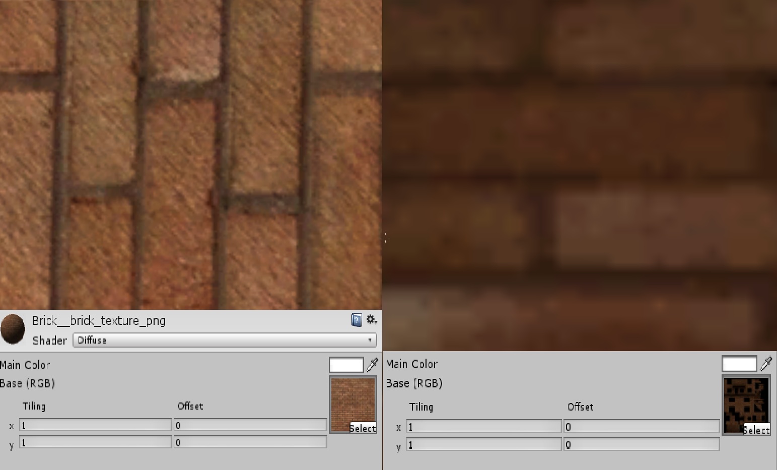
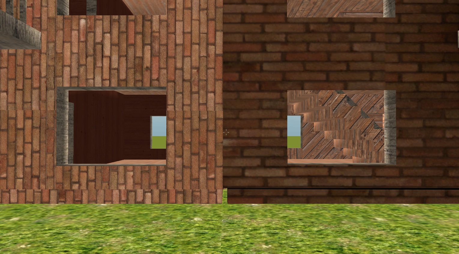
I'm making a building (a large object, obviously) and i'm wondering what the optimal way to visualize textures for the players are. I have this picture here to help me explain (close up shot of two same buildings with these two different methods, same distance, same source image for both methods, house and UV-baked image (RIGHT) are made in Blender).

The one to the left has a material with one texture in it's Diffuse slot (1024x1024), which will tile over the whole building, while the one to the right has a UV-mapped/baked image (2048x2048).
As this is a large building, i wish to have as much detail as possible on it, but i still want the game to run fast, as i plan to have a detailed scene with many, many objects. If i have a detailed house with many different kind of textures applied and use method LEFT (example: a room has one kind of texture for its walls, another room has another texture, the floor has one, the outside has one and the roof has one = 5 materials with a texture in each). And this is only with a Diffuse shader, i might wanted a bumped diffuse or something, or more textures for other various rooms, this could go up to 15 different materials with textures applied to them. I dare not even try to think out how many draw calls that will take. Ofcourse, this will make the house very detailed and crispy looking.
With method RIGHT i put every kind of image that the whole house will use into one texture (or atleast, a big part of the house) and then use materials the way they are suppossed to be used, or what i guess they are meant to be used for. (1 material for all shiny parts, 1 material for bumpmaps, 1 for diffuse).
This will make my computer happy, as it won't take as much computer power, but my eyes aren't that pleased, as it's very ugly as you can see, and this is only a UV baked texture of the outer walls, the rest of the house's components aren't mapped into that 2048x2048 image. With method RIGHT i can also put various detail to the house, like grafitti or something similiar, while method LEFT won't let me do that, as it's a repeatedly tiled image.
So the questions
a) Do you know any method to achieve the same level of detail/"sharpness" to the texture with the UV baked texture method without using 2048x2048 or 4098x4098 (I want to use preferably 1024x1024.) I know stacking the UV coords could help.
b) If you were making a detailed scene with alot of objects, what method would you go with, for a large object like a building? (A small object like a bottle, gun, crate etc. could use the UV-baked method (RIGHT), as you don't put your nose so close to the object that often then.)
c) Does the one to the right look good to you/would you care for it if you bought the game and the house in question had that fugly texture to it? (The game in question is in first person perspective, and it won't be too awfully action filled, so you have time to explore). DO NOTE: I can make both textures look better with other shaders, both use the Diffuse shader in this example.
d) Using method LEFT: How awfully bad would it affect the computer if i had, lets say, 50 of this same exact house copied all over the scene, with 15 different materials with various shaders, like Bumped Diffuse/Diffuse/Specular/Bumped Specular attached to the house).
NOTE: I use the same exact source image for both methods, which is a 1024x1024 image.
NOTE #2: I downloaded the source image for the textures from the internet, i do not claim ownership rights to it, as i just use it for testing purposes while i learn/make the game until i make my own handpainted/photographed textures if i go commercial (if i ever reach that stage).
Please ignore the fact that the one to the left are tiled the wrong way, it's the detail that i'm talking about. :D
And i'm only focusing on the outer walls, ignore the textures inside the house. Only the brick texture...
The reason the one to the right is dark is because i baked an AO map into the texture map and thus combined them into one.
Should i have made this as a forum thread ins$$anonymous$$d? Or is it suitable for Unity Answers?
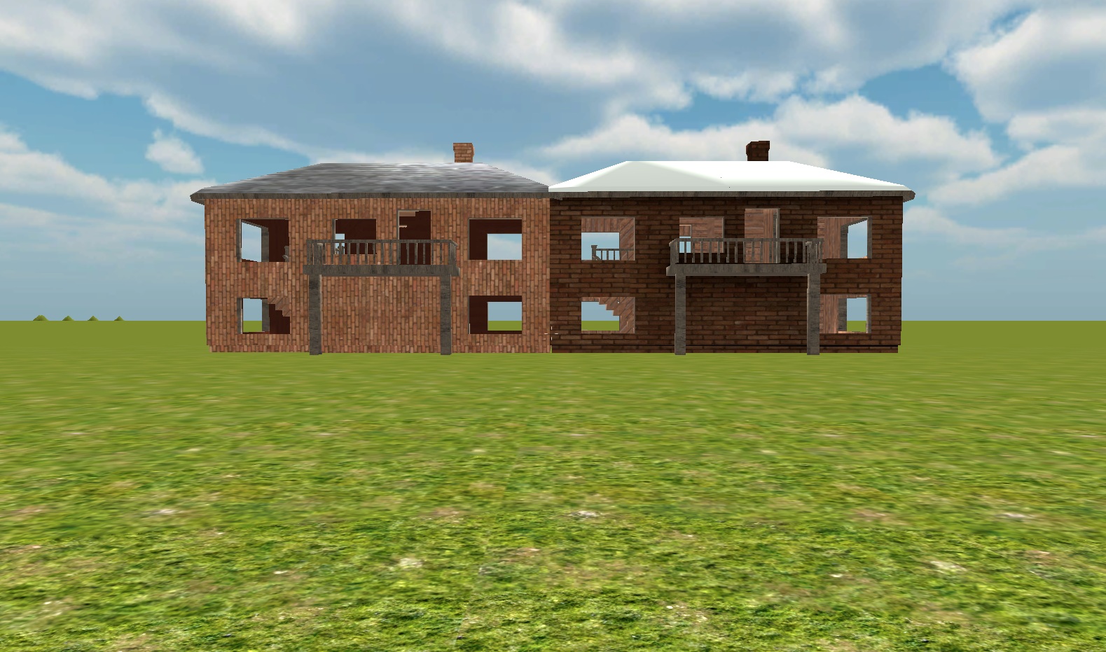
Do note that was a close up shot, here are two others from two different distances 

Answer by saphydawg · Jul 18, 2013 at 03:42 PM
Its possible that the RIGHT appears uglier than the one on the left because you are just zoomed further into the texture, aswell as it being darker, which means you have changed it somehow when making the diffuse map in photoshop. If you tile the LEFT texture down a bit until the bricks are the same size, you will see that the resolution is similar, if its still not that, then its probably a question of your image size, 20148x1048 may simply be too small for the entire building. This converation may interest you, it talks about the pros and cons of using one large map vs many smaller maps, it is focused on iOS development, but the principles are still valid, and may interest you.
http://forum.unity3d.com/threads/14660-One-big-texture-for-everything-VS-little-textures-per-obj
Hope i could be of help :)
Answer by Baldinoboy · Aug 30, 2013 at 08:47 PM
I know this questions old but it is something I've had to think about lately.
The repeating texture will look nicer in crispness but will be annoying to look at. I believe the repeating patterns would be more imperfect looking than a blurry baked texture which like you said can have extra detail. You could use a special overlay shader of decals for extra detail on the repeating texture.
I personally would prefer the baked texture. Also can make really nice detail with normal map baking.
Your answer

Follow this Question
Related Questions
What images do I have to bake in blender? 0 Answers
Importing blender files brings blank materials 1 Answer
When I Apply A Texture To My Object It Just Changes Colour 1 Answer
Import Blender models 2 Answers
How Important are uv textures? 1 Answer
