Computer Feedback That Helps Kids Learn About Math and About Themselves

Students are receiving more feedback from computers this year than ever before. What does that feedback look like, and what does it teach students about mathematics and about themselves as mathematicians?

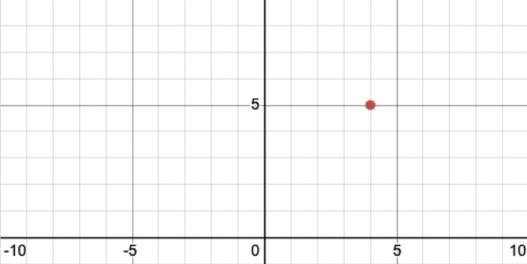
Here is a question we might ask math students: what is this coordinate?

A target point at (4,5).

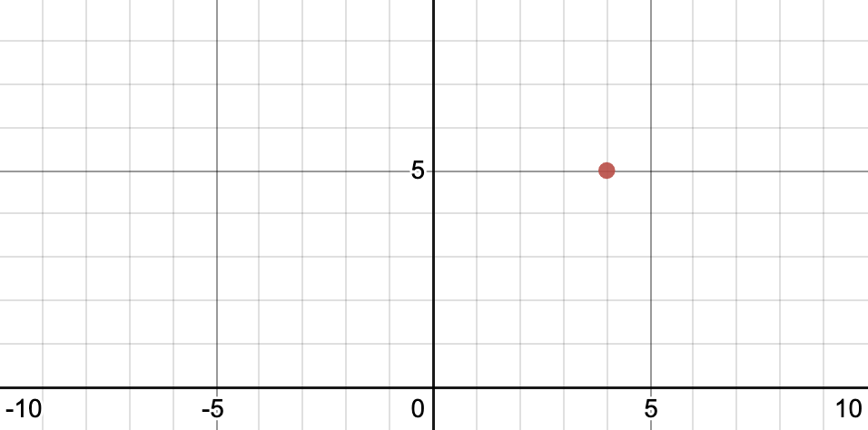
Let’s say a student types in (5, 4), a very thoughtful wrong answer. (“Wrong and brilliant,” one might say.) Here are several ways a computer might react to that wrong answer.

1. “You’re wrong.”

A red x appears next to the target point.

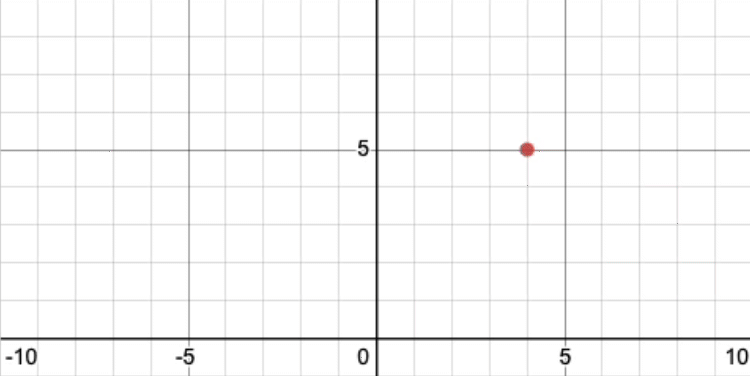
This is the most common way computers respond to a student’s idea. But (5, 4) receives the same feedback as answers like (1000, 1000) or “idk,” even though (5, 4) arguably involves a lot more thought from the student and a lot more of their sense of themselves as a mathematician.

This feedback says all of those ideas are the same kind of wrong.

2. “You’re wrong, but it’s okay.”

A red x and the message

The shortcoming of evaluative feedback (these binary judgments of “right” and “wrong”) isn’t just that it isn’t nice enough or that it neglects a student’s emotional state. It’s that it doesn’t attach enough meaning to the student’s thinking. The prime directive of feedback is, per Dylan Wiliam, to “cause more thinking.” Evaluative feedback fails that directive because it doesn’t attach sufficient meaning to a student’s thought to cause more thinking.

3. “You’re wrong, and here’s why.”

A red x and a message that the student might have switched the coordinates appears next to the target point.

It’s tempting to write down a list of all possible reasons a student might have given different wrong answers, and then respond to each one conditionally. For example here, we might program the computer to say, “Did you switch your coordinates?”

Certainly, this makes an attempt at attaching meaning to a student’s thinking that the other examples so far have not. But the meaning is often an expert’s meaning and attaches only loosely to the novice’s. The student may have to work as hard to understand the feedback (the word “coordinate” may be new, for example) as to use it.

4. “Let me see if I understand you here.”

No red x or message. The student's point moves out from the origin next to the target point.

Alternately, we can ask computers to clear their throats a bit and say, “Let me see if I understand you here. Is this what you meant?”

We make no assumption that the student understands what the problem is asking, or that we understand why the student gave their answer. We just attach as much meaning as we can to the student’s thinking in a world that’s familiar to them.

“How can I attach more meaning to a student’s thought?”

This animation, for example, attaches the fact that the relationship to the origin has horizontal and vertical components. We trust students to make sense of what they’re seeing. Then we give them an an opportunity to use that new sense to try again.

The student's point moves along the horizontal axis and then vertically to the student's point.

This “interpretive” feedback is the kind we use most frequently in our Desmos curriculum, and it’s often easier to build than the evaluative feedback, which requires images, conditionality, and more programming.

Honestly, “programming” isn’t even the right word to describe what we’re doing here.

We’re building worlds. I’m not overstating the matter. Educators build worlds in the same way that game developers and storytellers build worlds.

That world here is called “the coordinate plane,” a world we built in a computer. But even more often, the world we build is a physical or a video classroom, and the question, “How can I attach more meaning to a student’s thought?” is a great question in each of those worlds. Whenever you receive a student’s thought and tell them what interests you about it, or what it makes you wonder, or you ask the class if anyone has any questions about that thought, or you connect it to another student’s thought, you are attaching meaning to that student’s thinking.

Every time you work to attach meaning to student thinking, you help students learn more math and you help them learn about themselves as mathematical thinkers. You help them understand, implicitly, that their thoughts are valuable. And if students become habituated to that feeling, they might just come to understand that they are valuable themselves, as students, as thinkers, and as people.

BTW. If you’d like to learn how to make this kind of feedback, check out this segment on last week’s #DesmosLive. it took four lines of programming using Computation Layer in Desmos Activity Builder.

BTW. I posted this in the form a question on Twitter where it started a lot of discussion. Two people made very popular suggestions for different ways to attach meaning to student thought here.

Teachers Decide What’s Money

“Feel free to answer like a seventh grader,” I told teachers as I led them through one of the lessons from our Middle School Math Curriculum.

A printer prints out a scaled copy of a shape on an iPad.

The question about those images was, “What stays the same? What changes?” And people did not answer like seventh graders.

A response that has a lot of formal mathematical language.

Instead, there was lots of discussion around proportionality, congruency, ratios, and other attributes of the shapes that are going to be one million miles from the minds of seventh graders in school right now.

But several teachers took me up on my offer and answered a little bit like children. I snapshotted them, paused the class, and presented them.

A response that cites the color of the scaled shape.

Things they told me that stay the same:

  • The shape, the angles, the color, the orientation
  • The color and the angle of the vertices
  • The color and the paper size are the same
  • The shape and the color
  • Shape, color, orientation, centered on paper

“I love that you folks are finding patterns, noticing similarities, deciding what varies and doesn’t vary—including color!—using your eyes, your vision, your senses. That’s math!”

I read them an excerpt from Rochelle Gutierrez which is on my mind a lot these days.

A more rehumanized mathematics would depart from a purely logical perspective and invite students to draw upon other parts of themselves (e.g., voice, vision, touch, intuition).

By naming those responses “mathematics,” I turned them into money.

As a society, we decided long ago that certain pieces of paper had value—that they’re money. In much the same way, you are the central bank of your own classroom and you decide which student ideas are money. You decide which of them have value and, by extension, you influence a student’s sense of their own value.

I’m not hypothesizing here! Watch what happened with the teachers. On the very next screen in our lesson, we ask students to describe how this printer is broken.

A printer prints out an unscaled scaled copy of a shape on an iPad.

Teachers clearly received my signal about what kind of mathematics was valuable.

A response: "My shape is drunk."

They brought metaphors, imagery, and analogies that I don’t think they would have brought if I only praised deductive, formal, and precise definitions.

  • My shape is drunk
  • The lines do not stay straight…they are wobbly
  • My pacman lines are no longer straight. The new figure looks droopy and sad.
  • It got curvy, kind of sexy looking

The ability to decide what’s money is a lot of power! In this time of distance teaching, you have fewer ways to broadcast value to students than you would if you were in the same room together. But I’m so encouraged to see teachers using chat rooms, breakout groups, video responses, written feedback, snapshot summaries, whatever they can, to enrich as many students in their classes as possible.

I Hate Wine Tasting Like Some Students Hate Math Class

I live adjacent to the Northern California wine country, which makes wine tasting a fairly affordable and semi-regular kind of outing. (Pre-quar, of course.) But wine tasting makes me anxious and sweaty in ways that help me relate to students who hate math class.

  • There’s a sharp division between who is considered an expert and a novice, and an obsession with status (there are four levels of sommelier!) that’s only exceeded by some religious orders.
  • Experts seem to have very little interest in the intuitions and evolving understandings that novices bring to the tasting room. (What you’re supposed to be experiencing – the answer key – is written right there on the tasting menu!)
  • The whole thing is arbitrary in ways that we’re all supposed to pretend we don’t notice. (In math: the order of operations, the names of concepts, the y-axis is vertical, etc. In wine: the relationship between price and appreciation.)

I basically only enjoy tasting with a friend of mine, Michael Kanbergs, who is the man at Mt. Tabor Fine Wines in Portland, OR, if you’re local. He has expert-level knowledge about wine and enthusiasm to match but is allergic to most ordering forces in the world, including the expert / novice distinction. So he wants to share with you his favorite wines but he’s hesitant to offer his own perception too early because that’d undermine his curiosity about how you’re perceiving the wine.

I’m grateful to Michael for modeling good teaching, and grateful to other wine experts for helping me empathize a little better with math students who might find me and my habits alienating in similar ways.

The #1 Most Requested Desmos Feature Right Now, and What We Could Do Instead

When schools started closing months ago, we heard two loud requests from teachers in our community. They wanted:

  1. Written feedback for students.
  2. Co-teacher access to student data.

Those sounded like unambiguously good ideas, whether schools were closed or not. Good pedagogy. Good technology. Good math. We made both.

Here is the new loudest request:

  1. Self-checking activities. Especially card sorts.

hey @Desmos – is there a simple way for students to see their accuracy for a matching graph/eqn card sort? thank you!

Is there a way to make a @Desmos card sort self checking? #MTBoS #iteachmath #remotelearning

@Desmos to help with virtual learning, is there a way to make it that students cannot advance to the next slide until their cardsort is completed correctly?

Let’s say you have students working on a card sort like this, matching graphs of web traffic pre- and post-coronavirus to the correct websites.

Linked card sort activity.

What kind of feedback would be most helpful for students here?

Feedback is supposed to change thinking. That’s its job. Ideally it develops student thinking, but some feedback diminishes it. For example, Kluger and DeNisi (1996) found that one-third of feedback interventions decreased performance.

Butler (1986) found that grades were less effective feedback than comments at developing both student thinking and intrinsic motivation. When the feedback came in the form of grades and comments, the results were the same as if the teacher had returned grades alone. Grades tend to catch and keep student attention.

So we could give students a button that tells them they’re right or wrong.

Resourceful teachers in our community have put together screens like this. Students press a button and see if their card sort is right or wrong.

Feedback that the student has less than half correct.

My concerns:

  1. If students find out that they’re right, will they simply stop thinking about the card sort, even if they could benefit from more thinking?
  2. If students find out that they’re wrong, do they have enough information related to the task to help them do more than guess and check their way to their next answer?

For example, in this video, you can see a student move between a card sort and the self-check screen three times in 11 seconds. Is the student having three separate mathematical realizations during that interval . . . or just guessing and checking?

On another card sort, students click the “Check Work” button up to 10 times.

https://www.desmos.com/calculator/axlhe3shwg

Instead we could tell students which card is the hardest for the class.

Our teacher dashboard will show teachers which card is hardest for students. I used the web traffic card sort last week when I taught Wendy Baty’s eighth grade class online. After a few minutes of early work, I told the students that “Netflix” had been the hardest card for them to correctly group and then invited them to think about their sort again.

I suspect that students gave the Netflix card some extra thought (e.g., “How should I think about the maximum y-value in these cards? Is Netflix more popular than YouTube or the other way around?”) even if they had matched the card correctly. I suspect this revelation helped every student develop their thinking more than if we simply told them their sort was right or wrong.

We could also make it easier for students to see and comment on each other’s card sorts.

In this video, you can see Julie Reulbach and Christopher Danielson talking about their different sorts. I paired them up specifically because I knew their card sorts were different.

Christopher’s sort is wrong, and I suspect he benefited more from their conversation than he would from hearing a computer tell him he’s wrong.

Julie’s sort is right, and I suspect she benefited more from explaining and defending her sort than she would from hearing a computer tell her she’s right.

I suspect that conversations like theirs will also benefit students well beyond this particular card sort, helping them understand that “correctness” is something that’s determined and justified by people, not just answer keys, and that mathematical authority is endowed in students, not just in adults and computers.

Teachers could create reaction videos.

In this video, Johanna Langill doesn’t respond to every student’s idea individually. Instead, she looks for themes in student thinking, celebrates them, then connects and responds to those themes.

I suspect that students will learn more from Johanna’s holistic analysis of student work than they would an individualized grade of “right” or “wrong.”

Our values are in conflict.

We want to build tools and curriculum for classes that actually exist, not for the classes of our imaginations or dreams. That’s why we field test our work relentlessly. It’s why we constantly shrink the amount of bandwidth our activities and tools require. It’s why we lead our field in accessibility.

We also want students to know that there are lots of interesting ways to be right in math class, and that wrong answers are useful for learning. That’s why we ask students to estimate, argue, notice, and wonder. It’s why we have built so many tools for facilitating conversations in math class. It’s also why we don’t generally give students immediate feedback that their answers are “right” or “wrong.” That kind of feedback often ends productive conversations before they begin.

But the classes that exist right now are hostile to the kinds of interactions we’d all like students to have with their teachers, with their classmates, and with math. Students are separated from one another by distance and time. Resources like attention, time, and technology are stretched. Mathematical conversations that were common in September are now impossible in May.

Our values are in conflict. It isn’t clear to me how we’ll resolve that conflict. Perhaps we’ll decide the best feedback we can offer students is a computer telling them they’re right or wrong, but I wanted to explore the alternatives first.

2020 May 25. The conversation continues at the Computation Layer Discourse Forum.

The American Time Use Survey Is “Poetry, in Data.”

The American Time Use Survey is a fantastic data set. You can find out how many more hours per day women spend on household activities than men. You can identify the time of day that the majority of Americans wake up.

You can also determine the amount of time we spend with certain groups of people in our lives from childhood to late adulthood. For example, here are graphs of the amount of time we spend with friends and with co-workers.

graphs of time spent with friends and co-workers

Fantastic graphs, right? But will students think they’re fantastic? Will they learn from the graphs? How can you effectively introduce your students to the American Time Use Survey?

I use three strategies every time. You can read about them below and experience them in this new free activity from me and my colleagues at Desmos.

First, a meta-strategy:

I don’t allow myself to rest for a second in the false comfort that this is a “real world” context, and per se, interesting to students. Contexts are never “real” or “unreal.” They don’t exist in a vacuum. Contexts become real when teachers invite their students to interact with them in concrete and personal ways.

Here are three invitations I extend to students basically any time I’d like them to experience a graph as real.

1. I invite students to contribute their own data.

A table asking students to describe their OWN time usage.

The graph represents a group of people’s concrete and personal experiences: time spent with friends, co-workers, and partners. I ask students to contribute their own data so the quantities and relationships become more concrete for them as well.

2. I invite students to sketch their own graph before seeing the actual graph.

This invites students to share their own knowledge about the quantities and relationships. Students have ideas about how many hours people spend with friends throughout their lives. We should invite them to express those ideas with a graph.

The student's sketch and the actual answer.

I also place their own data from (1) on the graph. This extends an even more personal invitation to students and gives them an anchor for their graphing.

“That’s you on there, friend. Do you think American 15-year-olds spend more or less time with their friends than you? Okay, graph it!”

3. I invite students to reflect.

Jim Coudal called these graphs “Poetry, in data.” So I ask students to tell us which graph is most poetic and why. We’ve built up a lot of steam in the activity, and this question helps release it. It allows us to elicit from students the personal observations that haven’t yet found a home in our activity.

I posted this activity on Twitter and the majority of people said this was the most interesting graph to them.
Graph of time spent alone. It increases sharply towards the end of life.

People wrote:

It is sad to me that once we are old enough to have free time to spend with friends, we spend more time alone.

I wonder if the loneliness is by choice.

Alarming lack of social opportunities for seniors.

There is so much interesting research coming out about the impact of loneliness on people’s health.

How can we change this?

So consider the invitations you extend to students. In many curricula, those invitations are impersonal and abstract. “What is the value of the co-workers graph for a 75-year-old?” That’s a question that invites students to reflect on an adult’s knowledge of graphs and the context.

“What would your data look like? What do you think the graph looks like? Why?” These are questions that invite students to interact with the graph in personal ways, to inhabit the graph as if it were their own.

Featured Comment

Leigh Ann Mahaffie:

As I’m feeling mighty alone personally (even though there are folks in the house) and professionally (electronically just isn’t the same) during the current “Stay at Home” situation, this data definitely evokes some poetry for me.