- Home /
Does this look right?
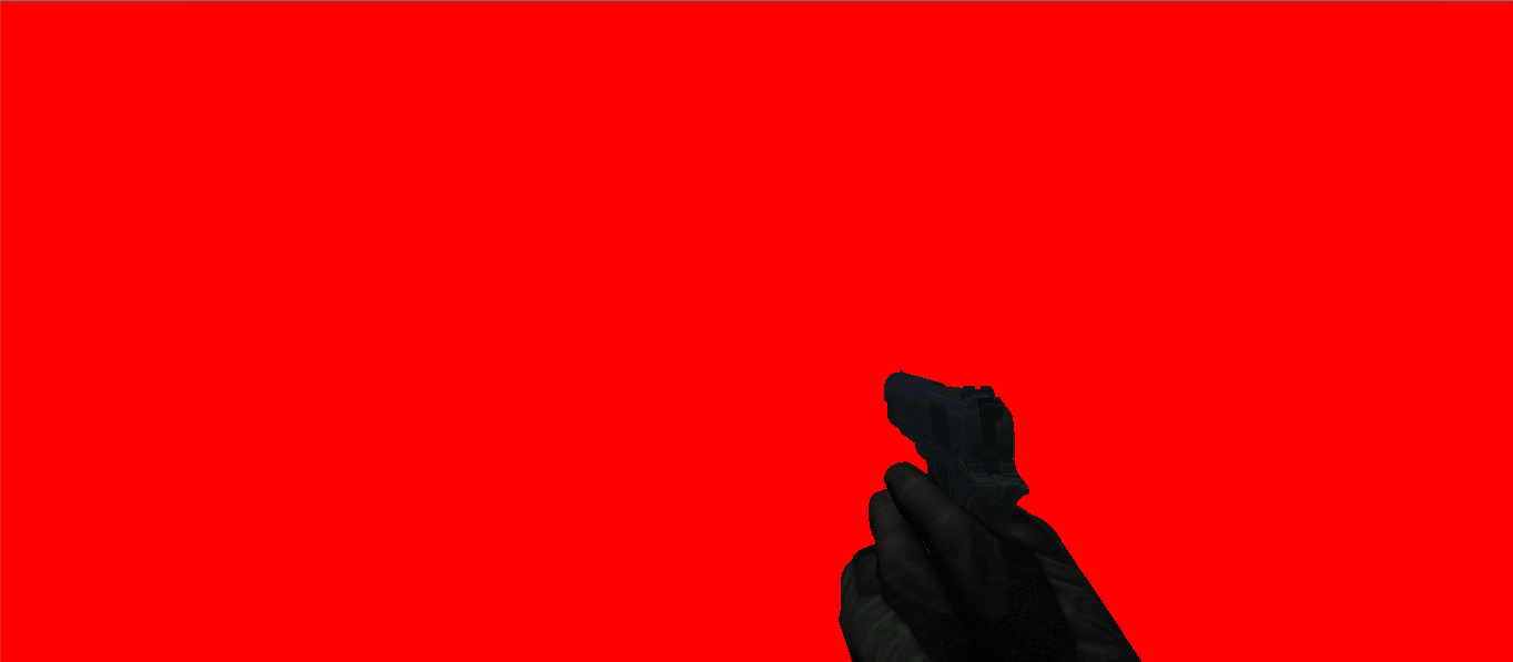
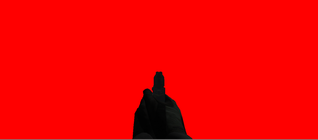
Hello, I'm trying to decide whether or not this looks okay. Assuming the red space is the entire screen the Player will see, how does the positioning of the gun in these two positions (shoulder and aimed) look? I could use some opinions on it:
Shouldered:

Aimed:

So what do you guys think? Any feedback will help a lot.
Thanks!
Right as in does it look like where it's "supposed to be" on the screen? - in terms of a standard fps camera, similar to the CoD player's view or any other modern FPS game.
This is a poor question for unity answers, and belongs more in the forum. UA is a place for questions that have objective answers, not subjective ones such as this. Also, the question title is not descriptive at all. This should not have made it out of moderation.
I would delete it, but it has already been answered
Your answer

Follow this Question
Related Questions
A node in a childnode? 1 Answer
how to change FoV 1 Answer
Aiming down a gun 4 Answers
how do i make my own GUI 1 Answer
nullreferenceexception object reference not set to an instance of an object 2 Answers
