- Home /
Shader supersampling
I'm currently learning about shaders and trying to write my own. In doing so, I'm trying to make a racing game that has that 80s neon Tron-esque wireframe look.
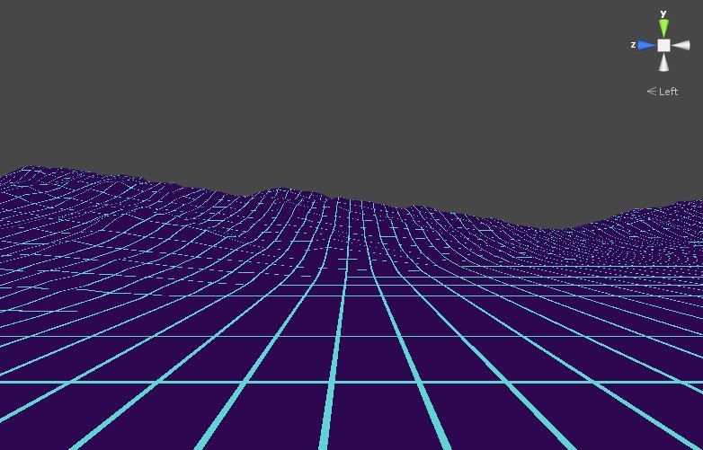
I've written a fragment shader that does... well, something like that.

That's pretty much what I'm going for, but as you can see, there's a lot of aliasing going on (it even looks somewhat better on the picture than in Unity). Since it's not a texture, I can't really do mipmapping, texture filtering or any of those readymade methods.
Does anyone have any ideas on how to improve this? My best guess is doing a second shader pass that does per pixel supersampling.
Is that the right way to do this? Also, if it is, I would appreciate any tips or resources on how to actually do shader supersampling.
Thanks.
Answer by tanoshimi · Oct 31, 2013 at 01:36 PM
As you've not posted your existing code, I'll just assume your current fragment function goes something like:
 // If this pixel lies on a gridline
 if (frac(x/GridSpacing) < GridThickness || frac(z/GridSpacing) < GridThickness) {
     // draw the grid colour
     return grid;
 }
 else {
     // Not on a gridline - don't draw anything
     discard;
 }
So you're defining a "hard" boundary between points that lie on the grid and those that don't. Instead, why not use the distance() function to calculate how far a point lies from the centre of each gridline, and define some sort of rolloff function (perhaps logarithmic?) to fade the alpha of pixels that lie further from the centre of each line. Those that lie further than a certain threshold could be discarded altogether as previously.
That will create the smooth gradient you're looking for without any need for a second pass (which I'm not sure would have helped you anyway).
Thanks for the reply. I can't believe I didn't think of that. However, that doesn't really solve my problem.

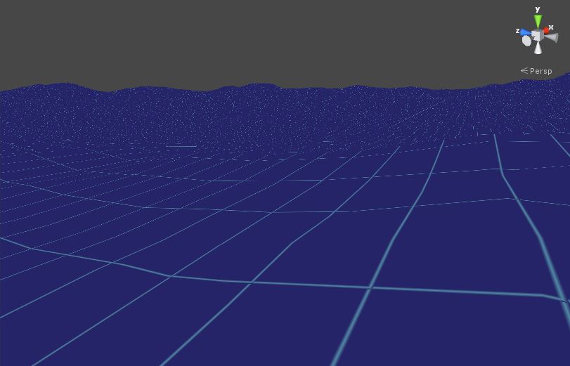
It's just something I jotted down quickly so it's far from perfect (the intersections look pretty bad, for instance), but it's clearly visible that the problem is still there.
Yeah, it looks much better near the camera, but everything that's a bit further looks pretty bad...
Your answer

