- Home /
Another quality problem with .png GUI graphics
Hi, guys:
I've seen a lot of questions like this, but none of them actually resolve me problem. I have drawn some buttons on Inkscape in png but when i use them in unity they look terrible, specially when the device has a small screen (mobile).
I'm using:
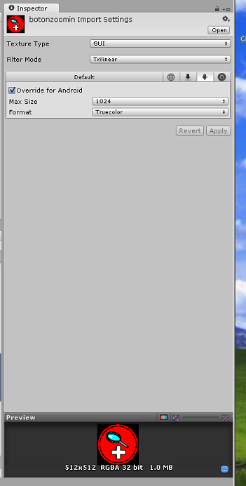
Texture Type: GUI Filter Mode: Trilinear
Override for Android checked Max Size 1024 Format: True Color.
The result is this:
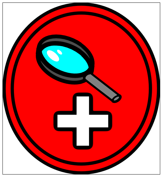
This is the original png, quite smooth, as you can see:

And this is the look it has in unity:

As you can see the black borders look like hell.
Do you know how to solve this? I've seen unity apps running on android with smooth looking gui buttons. I just dont know what else to try.
Any help is really appreciated.
Can you adjust so that it is a Power of 2? Would be interested to see if the Unity imported png looks ok once it is - while I don't do $$anonymous$$obile I DO use png for many textures, all power of 2 and they look fine.
O$$anonymous$$, i have converted the button in a 512x512 image using gimp, but the result is the same, the black line is heavily pixelated:

Try changing it from GUI to just regular Texture with Alpha as Transparency. There's an outside chance that will fix your issue.
Answer by Hoeloe · Feb 21, 2014 at 12:19 AM
This is because the GUI setting disables Mipmaps. Mipmaps are a fast way of resampling images to make them smaller in real time, while retaining quality. The way they work is by pre-computing various sizes of the image, and then indexing the appropriate scale.
When you disable these, however, Unity defaults to Nearest Neighbour sampling. This means that, when the size changes, it just uses the colour of the centre-most pixel in that area. This means that thin areas, like outlines, often end up missing pixels in some places, and being double-thickness in others. This produces artefacts like the ones you're seeing. The upside to nearest neighbour is that, if you're not changing the size by much, it doesn't blur the image in the same way bilinear sampling does.
What you'll need to do is one of the following:
Make the source image the size you want to display it at. This will give the best results, but is suboptimal if you plan to run this on screens of various resolution.
Set the texture type to "Texture" instead of "GUI". This will get rid of the problem, but your image may appear blurry if you're resizing it too much.
Create a custom texture format that uses Bilinear sampling instead of Point (nearest neighbour) sampling, but with mipmaps still disabled. I'm not sure entirely how well this will work, so it might be worth a try, though it may not work at all.
I recommend you look up some of the terminology I've used in this answer, and hopefully it will help you to understand what the problem is.
Solution 2 did the job perfectly.
It appeared a "white shadow" around edges but saving the alpha channel in GI$$anonymous$$P when exporting got rid of it, so now it looks perfect in game:

Thank you very much, Hoeloe, love you forever.
Your answer

Follow this Question
Related Questions
Problem with icon in GUISkin 0 Answers
GUI Button using .png image? 1 Answer
Button position 4 Answers
Gui Playing Audio Trouble 1 Answer
