- Home /
Fix Blurry UI text?
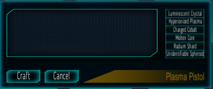
When I was building this UI, I didn't realize that resizing by pressing T and dragging the windows, I would totally screw up the resolution of any image I was resizing, and only later did I realize I should have been using the scale instead to preserve the resolution. That said, now I have a nearing completion UI that's starting to look bad, but my problem is that this UI is for a crafting menu. That said, because of the simplicity of the inventory system, I made the text contained in the UI and actual UI is a game mechanic just for ease of construction (i.e. if a light turns on as a result of the item existing in your inventory, then the condition for the craft button OnClick function is met and you can craft it). So I really don't want to destroy the UI and start over from scratch overlaying all the images and such, because that would mean a lot of backtracking on the game mechanics themselves as well. Is there some way I can set the UI elements all back to their respective default resolutions without getting rid of them, resizing them using the scale tool this time instead of changing the aspect ratio (i think that's what it is I was using?) to avoid destroying it and starting back from the beginning? Here's a screen shot to show the resolution deterioration I'm referring to as I created more panels on top of panels. This isn't the whole UI, but the other screenshot exceeded the limit, but there is another behind this one also. The text in the bottom left of this was created second (after the panel that's behind this one) and then the text on the right in that selection box was created third, and even between these it's pretty easy to see and by the time I got to the text in that menu on the right, It became near illegible. Thanks in advance for any help you guys might have

What kind of objects are you using for the text? Is it just an image or is it a text$$anonymous$$esh or something?
the text objects are just the standard text that comes parented to the button when you create a UI button from the create menu. I just swapped out the sprites and the text font
I am not sure this is the problem or if it will help - but maybe the scale of the text objects are scaling with the parent objects - so maybe try dragging them out so they arent children of those buttons, reset their sizes (scale) to be correct aspect, then drag them back into the buttons as their children. Perhaps this will help?
Actually $$anonymous$$D_Reptile that did fix a large part of the problem in that it did restore the aspect ratio, so that was a large relief because I didn't have to restart the entire crafting UI. But, after some experimentation, if anybody else finds this later and wants to know how to fix it, I found that if you scale up the width and height to some massive number, then bring the font size up to match it, you can simply use the scale tool to then bring it down without losing resolution. Should have been more obvious I guess considering I even mentioned the concept in my question somewhat but I didn't put two and two together. Now though it's crystal clear, so thanks for your input guys
Here's a video how to do it in 1 $$anonymous$$ https://www.youtube.com/watch?v=vARzcwlA2qI
Answer by beefjerkay · Aug 28, 2017 at 06:09 AM
The best way I've found is to:
1) Increase font size massively (size 150 or something).
2) Set both horizontal and vertical overflow to 'overflow' in the inspector for the text box.
3) Scale the textbox down using the scaler tool.
The text should now be sharper.
I want to note this. When you play with scale, ideally X and Y should be equal. Lol, I've spent almost 15 $$anonymous$$utes wondering why my text looks stretched horizontally.
Please do yourself a favor and don't do this. Every part of this answer is screa$$anonymous$$g "future headache" when you want to change anything. Follow the "Dynamic Pixels Per Unit" answer ins$$anonymous$$d.
Answer by Bip901 · Jun 22, 2017 at 05:15 PM
In the canvas (Canvas Scaler component), set the "Dynamic Pixels Per Unit" value to something higher.
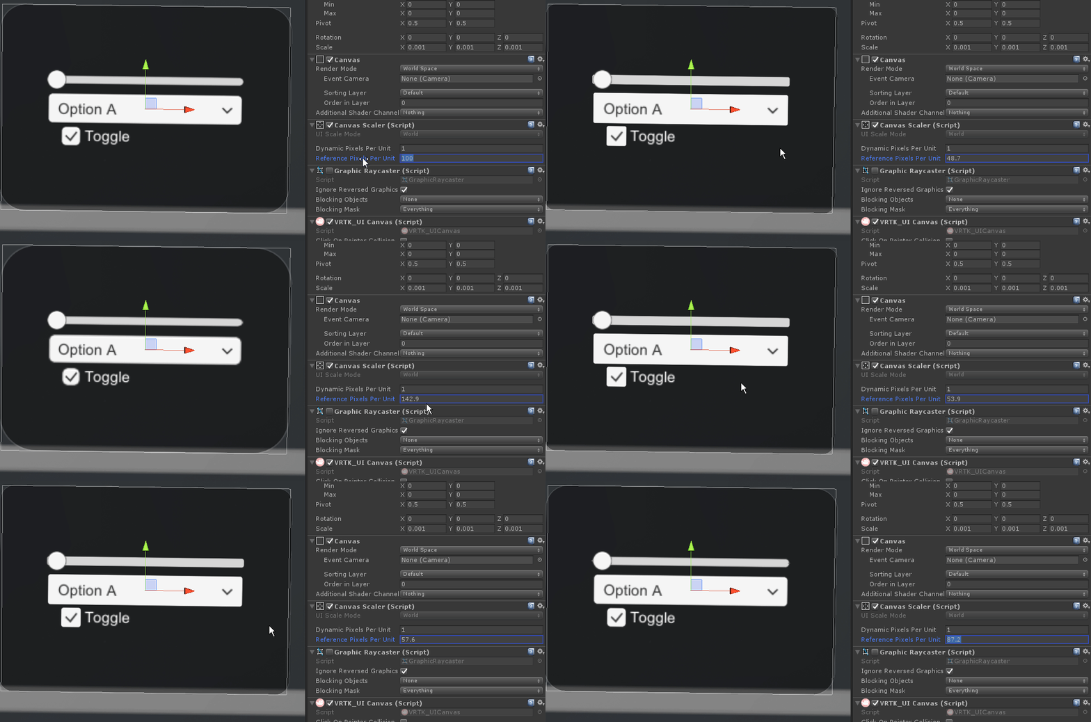
This seems to work on sprites, but for some reason it doesn't apply to the text inside the UI elements, which was the main issue. See example below.

It also breaks the graphics of UI elements as you can see on the edges of the UI elements in the gif screenshot.
This answer is correct. In your gif, you are changing reference pixels per unit, whereas the answer is stating that you should change dynamic pixels per unit, which I can confirm to be the correct solution.
Right, I'm a bit new but I did change that and it appeared to have no effect on the text/labels inside my canvas. In my case, I was able to resolve my problem by ins$$anonymous$$d importing my own font and then in the import settings in the inspector, configuring the font size to something a bit larger like 30 or 60.
Sorry for the misunderstanding, though!
I think Dynamic pixels per unit doesnt exists anymore in Unity 2019, any new solutions?
Answer by U_Ku_Shu · Aug 08, 2016 at 11:21 AM
I had post few solutions for this problem here:
http://answers.unity3d.com/questions/1226551/ui-text-is-blurred-unity-535f.html
Answer by Zacka · Oct 04, 2019 at 01:55 AM
Enabling Pixel Perfect in the UI Canvas was the solution to my blurry text issue.
Your answer

