Best Texture practice in small enclosed areas?
So I am developing a game which is played in large amount of small, enclosed rooms, each room has a door centred on each wall. With most of the back-end of the game in place we are now focusing on getting the textures just right for the game.
The game largely focuses around picking up on small details in each room so we know we need high quality textures (Currently the room UV map is at 8k). However, when you are walking around the room the plain textures just do stand out enough. We decided then to have a go at using normal maps but that just does not work whatsoever in small areas where you get close up to the textures with the normals applied.
The game has a lot of focus on lighting as well as this is one of the main themes. The game is supposed to be dark and gloomy as if you were walking around an 100 year old hotel so sound will help when we get round to doing the sound for the game.
We do not have access to much money at all, as most of the money we had (Which was not much) got spent on getting the high quality textures (We used textures.com), so if you want to recommend any software please consider that our current budget for this is pretty much nothing.
So, what is the best way to make our high quality textures more immersive for a better overall feel to a game where you are in a large amount of square rooms?
Any help is appreciated.
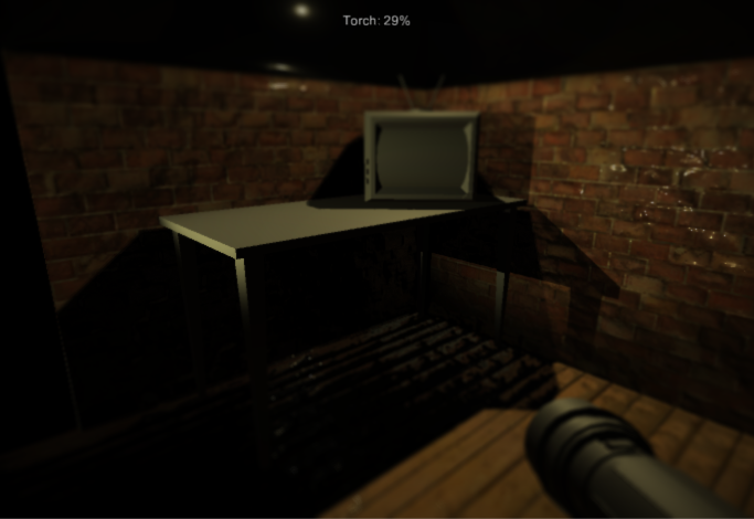
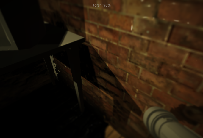
Edit: Added some images: 

Answer by dskeith · Dec 10, 2015 at 05:18 PM
Normal Mapping & lights with falloff seems like the simplest way to make a texture more immersive. That said, there are limits to what can be accomplished with textures and a cube. It sounds like textures aren't enough and you might need to start modeling the details in your environment.
Perhaps if you post some images of your current results, the community can give you more informed suggestions?
Added some photos, as you see although the normal map looks good from a distance the second you get up close it just looks terrible, the textures are not the highest quality version as I am waiting on an updated UV, note these are just the base textures and we have no added any of the intended grunge etc, but our primary problem is just how bad normals look when you get up close, which is a main part of our games theme.
Do you have a depth-of-field image effect on those? That may be part of the issue.
I've played around with depth of field post processing effect on the camera, but with a game that involves looking at close detail it doesn't help. Although it does look better from a distance if it goes out of focus, I need to to be in focus when they are looking at the walls and floor.
The main issue here seems to be low texture resolution. Once you get close to the texture, it starts to get blurry because there just aren't enough pixels to render a clean result.
It's also possible that the normal maps you're using aren't particularly good. You may want to investigate a program like Bitmap2$$anonymous$$aterial or CrazyBump to generate normal maps based on the appearance of light in your images.
I think you may be right, we do actually use crazy bump for our normals, at least for as long as the trial lasts... ($$anonymous$$oney is always an issue) I think that the sub quality textures led to a sub quality normal map, hopefully when our graphics designer gets his internet back we will get the higher quality UV and hopefully that will solve our problems.
However for me the loss on the normal maps was that even crazybump could not accurately pick up on the gap between each brick, and rather picked up more on the finer details, maybe playing around with the settings would produce a better result, I guess its all just about fine tuning.
Your answer

Follow this Question
Related Questions
Texture stuck on Black! 0 Answers
Lighting / Tiling Texture Problem 1 Answer
Textures on models have a green tinge 1 Answer
Lighting problems using tiled mesh terrain is creating edges between tiles 0 Answers
Albido UV map 1 Answer
