- Home /
UI behavior on resolution change
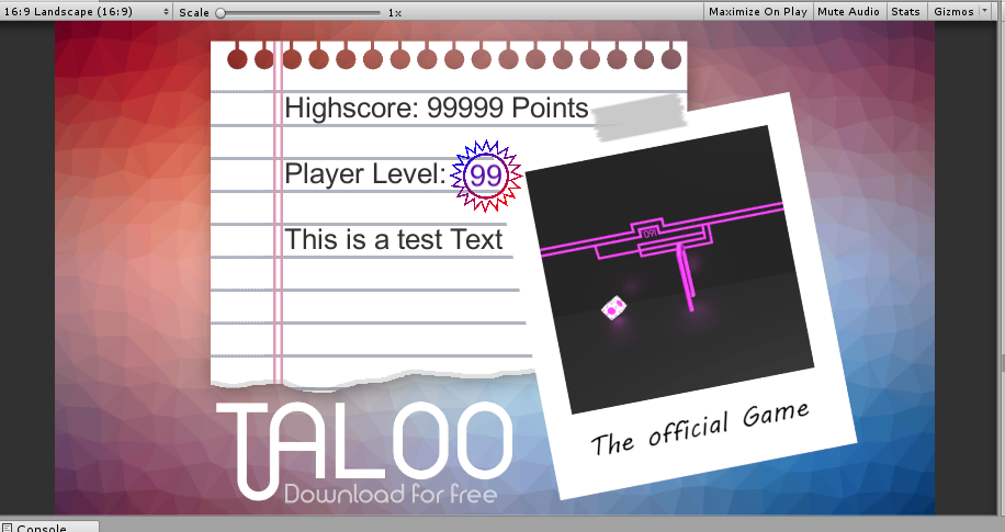
Hello there, I have a Canvas (for sharing purpose) that look something like this: (in 16:9) 
This Canvas is consist out of 2 parts: The background Image made in GIMP and the Black Text(including the Icon behind the "Player Level" Text) on the paper looking like panel.
MY PROBLEM: When I now change the resolution of this Canvas to 18:9 the Image gets streched and the text misplaced. Also if I Change the resolution to a custom value of the editor, the Text messes Up Completly. Like this: ![]()
So my Question is: How do I alline (or Atache) the Text To the background Spirte so it doesnt change its position with a diffrent resolution or ratio. So that the text is kind of attached to the upper corner of the Paper looking like Panel and not the whole background Image.
I already tried the anker positions but they didnt work, because the text still crossed the lines on the paper.
If you have an Idea what could help me or just a hint in which direction I have to dig, feel free to comment. Thank you in advance
With love from Switzerland Tom
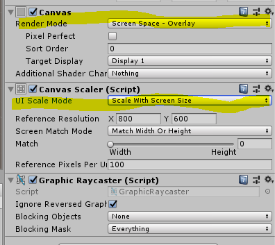
Have you set the canvas to scale in the canvas scaler component? then the only solution would be to use anchors to make it fit
Your answer


